
Warning. Math concepts in here. This is a supplemental writing to help people understand the bigger picture, for those that read DD and research.
With gold to break out with this analysis, by proxy, it should take silver with it. I believe the macro picture of the banks going the lowest net short since 2015 in silver supports this thesis that will unfold below for gold.
***Edit *** – if you are fretting about the shake down the last few days, it’s all good. What this APPEARS to be is a final flush before the move up. Gold has been having massive reduction in open interest. Silver now lowest short position with big 8 in 6 years. It appears that price is about to melt up and big banks are getting out of the way. This is usually done by papering the markets at illiquid times, then buying back shorts cheaper and buying up those customers they just tripped the stops on. I’m expecting strong, strong, strong moves up in the coming weeks as the freight train is barreling down on anyone short.
I could be wrong. Take a look at the charts below and the macro picture and decide for yourself. I’m EXTREMELY excited about the weeks ahead!
*** End edit ***
In my video with Patrick Karim and Kevin Wadsworth, Kevin busted out some of the arcs. We talked about them a little after the video. I’m not going to lie, a few months ago when seeing them, I was skeptical. I was seeing arcs everywhere then on FinTwit. Everyone joining the party.
What was bothering me a little was that people were putting arcs in all over the place where I didn’t see it. Forcing an arc somewhere.
Step back, and let’s look VISUALLY at an arc. In Kevin’s picture below, we are mostly all familiar with the cup and handle. These arcs are well known by many in the gold circles, and aren’t really in dispute. My issue isn’t with these, at all. But what’s of interest here is I think I tied them to Michael Oliver’s momentum structure analysis, in a way.

Momentum structures. Michael Oliver in HIS video with Patrick and Kevin went over Momentum structures. What an act to follow, right? Well, I watched that video now maybe 3 times. I needed to digest what the hell I was looking at. In a sense, it looked to me like acceleration and deceleration in my general physics classes in college.
Momentum is defined as: “the quantity of motion of a moving body, measured as a product of its mass and velocity”. You can think of an 18 wheeler barreling down the road with a full load and a small Mini Cooper driving next to it – both are traveling the same velocity, and a deer runs out in front of the road. Because the 18 wheeler weighs a lot more, it takes longer for it to stop. By a lot. Essentially, the weight in this equation is squared, I believe. Meaning, something of bigger size takes longer to stop. It takes more energy to stop. Likewise, it takes more energy to get it going.
The CONSTANT rate of movement is VELOCITY. The CHANGE in velocity is acceleration or deceleration. This is when people might say, “momentum is gaining!”
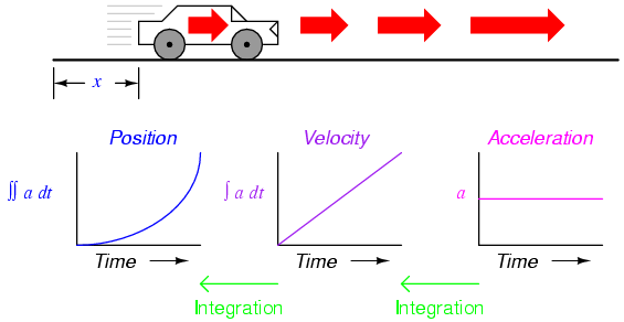
In this simple chart I stole from the internet – you can see velocity can increase while the RATE of acceleration is flat. If momentum deals with velocity and “mass” (I’m now thinking the size of the gold market relative to the bond market, or perhaps a mini cooper relative to a mack truck), it then stands to reason that if you INCREASE the acceleration, it increases your momentum – the fluctuation in constant velocity is affected by acceleration (financial energy). Likewise, deceleration is the reduction in velocity, and removal of financial energy.
When looking at the charts of “momentum structures” it then occurred to me you are looking at, against the zero line (constant speed), acceleration or deceleration, which then increases or decreases the momentum. Remember the mack truck barreling down? Well, as you accelerated to a point in time, you increased the velocity, and thus the momentum, and thus it requires significant effort to then stop that truck.
Fuel needed?
When a plane takes off, it needs an amount of fuel to push it forward before Bernoulli’s principle takes effect and enough pressure upward gives it lift.

The air that exists is also like a swimmer going through water – your hand acts as a paddle to pull you through the water. I bring this up because the higher you go up, the thinner the air is. Gravity is pulling down on you, and thus to accelerate or travel higher up, you must consider the air pressure at altitude, the headwinds/tailwinds, and the amount of fuel needed to perform this tasks.
Likewise, a truck that needs to go faster hits the accelerator and it burns fuel to increase the velocity. You have the coefficient of friction with the ground, tires – perhaps a hill you are traveling down or up (inflation I’ll get to) and with this, also traveling into walls of air.
To accelerate, thus you need to consider you need to expend a lot of fuel. Consider to go from 10 to 20mph in a car it doesn’t require twice the fuel to accelerate, it may need 4 times the fuel. With slowing down, remember, weight is a factor in this and I remembered the weight was squared.
Meaning – it takes a LOT more fuel to get an 18 wheeler from 10 to 20mph than a Mini Cooper. This can then say you need a lot more fuel to make the bond market rise than the gold market and many more times than the silver market.
Market sine waves
I looked at the markets as sort of a living, breathing thing. There’s so much money out there, and at times the markets expand, and at other times they shrink. Some of this is healthy. Think about opening a lemonade stand on your block and charging $.25. Cars lined up around the block. Others see your business, have low barriers to entry, enter the markets. More competition drives down prices. More people enter the market. However, there’s only so much money to go around for lemonade. Those that charge higher prices or have inferior product are ran out of the industry. It’s a “survival of the fittest”.
This is what you can sort of envision the markets like, over a long term. This shows the expansion and contraction of markets. I showed in earlier writings and videos how gold has this relationship with just about every other thing on the planet over history. It essentially is why you can buy the relative same purchasing power (a man’s fine suit) with one ounce of gold.
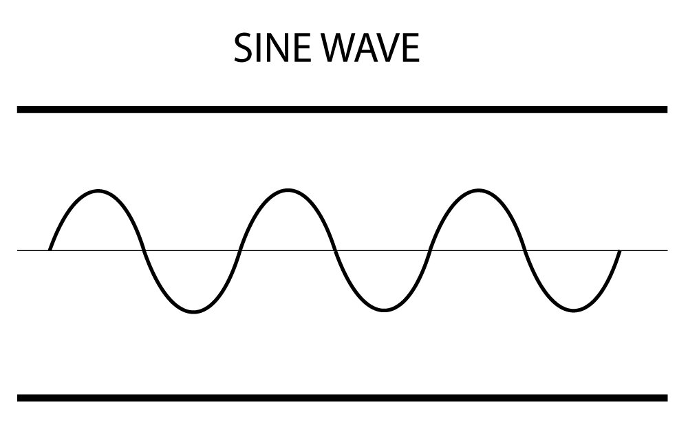
Above, this suggests a constant amount of financial energy in the system. For example, your block only has $100 for lemonade per day.
Now, if the M2 money supply increases drastically, for a myriad of reasons, this shows the ability for this money to then enter the markets. This then has the sine wave on an angle.

This might be how you can view the markets over 100 years…

And in fact, this is what we see…

Essentially, you see the M2 money stock going up 10x in 40 years, but the DJIA going from about 1,000 to 35,000, or about 35x. However, one could then argue from 1980 to 2009, it was only an 8x, but the acceleration of money printing the last 10 years has disproportionately found its way to the stock market.
I bring up the above because when looking at momentum structures – 0 is the constant velocity, and numbers above zero show an acceleration of financial energy into the item.

I took the snippet above from a portion of the gold chart I want to look at in a bit. If you see the top portion of this image, you are seeing the run up between 2001 and 2008. In the green area of this picture, all of these values are above the black line, which is zero. The red items here show a SLOW DOWN of acceleration in an uptrend.

In the above snippet, you are seeing the downtrend from 2011 on in the arc. The below part of that shows how the red lined then crossed below zero.
The idea with the above two pictures are to show you how the uptrends and downtrends you see visually in arcs are represented by acceleration and deceleration of financial energy.
Now we go over the charts. I’ll take a BROAD picture to start. I wanted to analyze the two most well known cup patterns (arcs) to see what I can learn overlaying this on momentum structure analysis. What I think you can delineate is
- the down trend
- sideways chop
- the uptrend
Then, at the end of the cup here I will also go into the formation of the handle. I’ll save that for last, because that’s where we are today.
As a bonus, I overlaid RSI with this, because I felt it important to SEE what the RSI looks like in the down trend, sideways chop, and uptrend. Could be something?

There’s a LOT going on here big picture, but I want to look at both of these cups to see similarities. I’m going to use the above chart and break it down into smaller chunks to visit. At the top part of this chart is price action, in which you see the cup and handle from 1980 to 2000, then the strong move up from 2001 to 20011, then the 2011-2020 cup with the 2075 2020 high. I will take a look at the handle in 2008 compared to 2021.
1980-2008 cup…

Left arc
Once that became stupidly overstretched, you can then see the move down. I did a 72 week period for the MomStc because I felt gold is a “mack truck” with a $6 T market compared to perhaps a standard S&P 500 company. So I stretched out the periodicity to thus capture the cruise liner moves more accurate. Think of standing and looking out, you see a flat earth. If you go up 5,000 feet on a mountain pass, you can then see the curvature of the earth. The larger the structure, the higher elevation you need to go to observe the true structure.
You then SEE the deceleration in the MomStc chart and RSI goes below 50, and stays in chop between 50 and 30. There appears to be a strong move up in 1983, but this is an outlier and perhaps a good short term trade.
Chop
Whether this cup has a curved bottom or goes sideways makes little difference to me in any way, shape, or form. What you see then is the MomStc trading around zero with periods of up and down. The RSI is wildly up and down. But if you look at price action, it’s stuck in chop for a period of time. In the MIDDLE of this chop, appeared to be an outlier of higher MomStc. Perhaps this is a signal that the boat is at the middle of its turn? It doesn’t mean price goes up tomorrow, but it might signal about halfway through the turn.
During this chop, you can see lots of MomStc channels you can draw. Lots of great trading opportunities it seems to go long on a highly negative MomStc – but I would not short the higher Stc because you cannot really tell when the breakout happens.
Right arc
It did appear then there was a turning point on the right side, where at the end of a MomStc channel that went pretty negative, you had a sharp move up. The then formed several descending triangles and wedges in succession and appeared to be acceleration to drive price action higher and higher in a stair step fashion. What I also noticed during this range was the RSI was always ABOVE 50. So there’s even opportunities within this bull run to play pullbacks with RSI, if you were getting in long at 50.
End of trend (handle down)
You then saw an RSI break down below 50 at the same time the MomStc broke below zero with lots of red in the trend.
This finished the 1980 to 2008 cup. What isn’t shown clearly here is the 2008 high of 38 on the MomStc. I zoom in below.

This is after this period….

What you are seeing here from 2001-2008 is 7 years of constantly being above zero in the MomStc, meaning there is always additional fuel (financial energy) getting thrown into the fire and no more can go onto it. I believe at THIS part you are so overstretched from the 200dma and 50dma that it is signaling market participants to take profits.
Essentially, this is like a plane hitting a high altitude and the air is thin, no matter how much higher they try going, they don’t have the fuel. Warning lights are coming on, and you back off the gas to then perhaps cruise for awhile and glide.
2008-2011 (handle top)

End of cup and handle. You see then when the MomStc breaks down from the sideways channel that to me, this signaled the beginning of the end. Check it out…

Shortly thereafter, you see the RSI break down below 50 for the first time in 3 years. To me, this is when the smart guys got the hell out and rotated everything they had elsewhere.
2011-2020 Cup

Like in the 1980-2008 cup, you can clearly see the left arc, sideways chop, and right arc. You can then clearly see the same types of patterns emerge…
Left arc – you see a decreasing Momstc that goes below zero in the red ellipse. If I ever would short in my life, this is when I would have done it. You see the RSI hovering aroudn 50, then breaks down.
Sideways chop – The yellow ellipse here in the MomStc shows periods under 0, a halfway point turn around, then periods of time over 0. As if you could SEE the cruise liner turning around. This sideways chop had a lot of variance with the RSI, so GREAT trading opportunities. You can see that peak up in green in the middle. During which you are seeing 70 RSIs. This could be the “false breakout” in 2016, but to me, it was the halfway point of the arc.
Right arc – You can then see this in the green on the MomStc where there was lots of green “acceleration” and lots of time over the 0 MomStc. The RSI during this entire time was over 50.
End of Trend (handle down) – just like in the 2008 cup, you can see where the MomStc gets extremely overstretched and sort of is a blow off top of sorts. This peak here was at 31. You can then see this flagging just like in 2008-2009. That was clear by not only the RSI decreasing, but the MomStc worked its way to zero and just like in 2009, went below the 0 line for a period.
2021-2022 or 2024? (handle top)
One thing that concerns me about this handle top move is the 28 years to build the 1980-2008 cup with the 3 year handle top. If this cup only took 9 years to form, it might suggest the move up is only 1 year in time. What is more interesting though is that this cup is deeper than the 1980-2008 one. Meaning, the “measured move” for this top is about $3000. This could be an explosive move up, IF the pattern holds. However, you can see the flagging for this move from 2020 is longer in duration than the flagging from 2008-2009, so it’s possible we still may have a 3 year run IF this has to do with the flagging.
Comparing the handle downs (flags…)

While both of these are EXTREMELY similar, what does stand out here for me is the drop in price on June 17th didn’t fit the pattern. I think many people (including myself) thought we were about to head for blue skies territory.
What I can tell you is that the correction in 2008-2009 looked to be about 30% over a year. So far, we have hit maybe 20-23%, so we are pretty close I’d think to seeing the up move now ahead for 1-3 years where that MomStc stays over 0, RSI stays over 50, and we head for $2500-$3000.
What complicates this move could be the Basel 3 – this MIGHT be why we are seeing the flush down June 17th and then the massive attack last night. It seems that this IS about to run hard, and those who are short need to get the hell out of the way of the Mack truck. Once they step out of the way, you will start to see the MomStc well above zero, stay channel bound, price rise HARD, and RSI staying over 50. The below is the 2009-2011 run which could be duplicated here?

Conclusion
I think what Kevin Wadsworth sees in arcs is essentially momentum structures doing their thing. Some of his arcs are shorter term, some are longer term. To me, the smaller the market, the easier it is to have short term arcs. Remember, stocks that are illiquid can move quickly with massive buy or sell orders. The larger the entity, the bigger the truck, the more mass, and the longer the duration you need to look at to see momentum clearly. In my gold chart, I was on the weekly chart and used 72. The default is 36. Perhaps for Apple I might use 36. Maybe for silver I use 18?
Path forward
Now that I think I understand momentum structures, and how you can visually see them with arcs, I’m going to look around a lot more for these and pop in the MomStc (momentum structures in trading view) to see if what I see is consistent. To me, the math bares this out with the picture below. You can literally see the cruise liner turning around…

Lastly – I brought up the sine wave thing because in the gold example, you seem to have a flat line for a cup, but I don’t think that may be the case in a lot of equities that have seen a lot of jet fuel coming in to the markets. Meaning, their momentum structures would be on a trajectory that has an angle over longer periods of time, I would think, to account for inflation of the markets. It’s possible what we think of as an “overshoot” on the cup in the cup and handle is inflation popping its head on the other side of the arc. Consider if inflation is to be accounted for the 1980-2008 cup. What does that look like?

Point is – the cup can be on an angle – you are caring more about the 4 distinct phases:
- Left arc
- Center chop
- Right arc
- Extension
The implications for this is if you can identify a flagging area and the chop, that breakout might be the halfway point in the arc. This could get you in pretty early on things, but could also be dastardly if you are in too early. What it MIGHT prepare you for is then seeing that green right arc, the pull back, and the extension. You can go long the right arc, using the green ellipse to show MomStc and RSI below, then short the handle down, then go long the extension up and ride it until MomStc trends down out of its range and RSI dips below 50. Ride is then over and you can short for years.
I obviously have to test this with other stuff, but the idea here is arcs are visually representing momentum changes. The bigger the market, the longer out I’d use for the range.
The immediate implications are that literally any day now gold will start on the MomStc uptrend, and with that, take silver with it. My next analysis this week will be silver, and I want to see if the arcs and MomStc are related. I will reduce the periodicity of it most likely from 72 to 36 or 18 to see if the size of the market relative to gold then screams out at me.
Leave a Reply